BHIM UPI - Redesign
UPI App Redesign - Case study
About
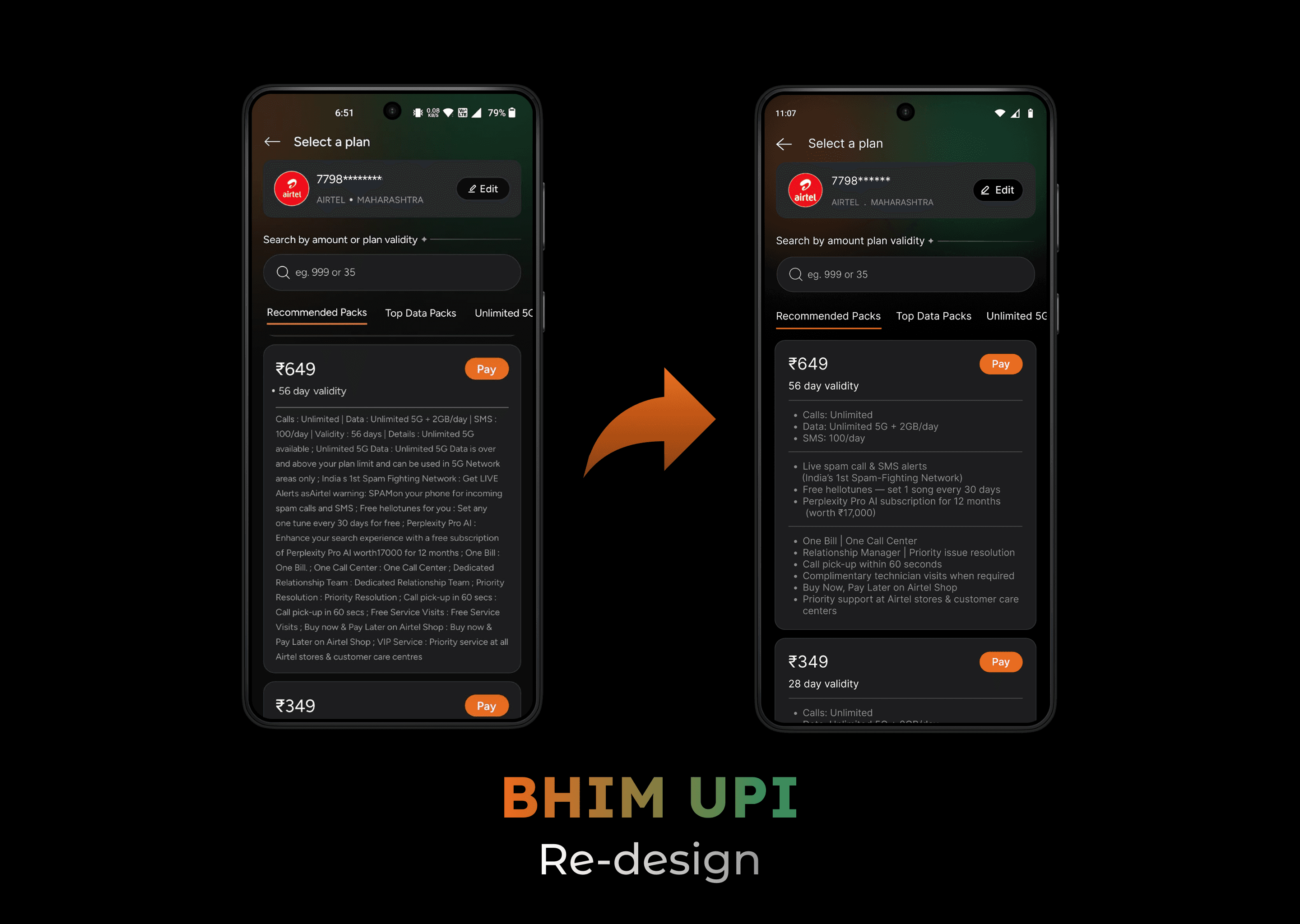
This is Redesign of BHIM UPI's Recharge and Bills section. Existing version of Recharge screen is bit cluttered so I tried to Redesign it to minimal, easy to understand, clutter free UI for smooth Recharge and Bill payments.
Problem
One day I opened BHIM UPI to make my mobile recharge, I was checking Recharge plans but I observed too much cluttered information, which make me close the app.
Solution
Redesign the Recharge especially the plan details section and make it clutter free and easy to understand.
Sort the plan details section into top priority, mid priority and least priority sections.
Solve visibility issue and avoid information chaos.
Why choose BHIM UPI?
Unlike other Competitor Apps it doesn't charge platform fees for Recharge and Bills.
BHIM UPI is government backed digital payment app developed by National Payments Corporation of India (NPCI).
It is considered as Highly secure, trustable and reliable app.
Design process
Define problem
Competitor research
Redesign App
Usability testing
Iterate
Competitive analysis
Recharge Fees
Bill Payment Fees
PhonePe
Small fees
Card fees
GPay
Yes for certain
Yes for card
Paytm
Some
Some
BHIM UPI
Free
Free
User personas
Name: Rahul Mehta
Age: 27
Location: Pune, India
Occupation: Software Support Executive
Income: ₹30,000–₹40,000 / month
Device: Android (mid-range smartphone)
Network: Airtel (Prepaid)
Bio:
Rahul needs a quick and scannable way to understand recharge plans because dense text and poor information hierarchy make decision-making slow and frustrating.
Goals:
-Quickly understand what a recharge plan actually offers
-Compare plans without reading long paragraphs
-Know daily data limits vs unlimited 5G clearly
-Make a confident recharge decision in under 1–2 minutes
Pain Points:
-Overloaded text: Long, repeated sentences confuse him
-Unclear benefits: Unsure what “Unlimited 5G” really means
-Time-consuming: Has to scroll and reread to understand basics
- Cognitive overload: Too many features shown with equal priority
Recharging during:
-Office breaks
-While commuting
-Late night when data is about to expire
Typography and colours
Inter
H1 - 24 - Bold
H2 - 18 - Bold
H3 - 16 - Semibold
B1 - 14 - Medium
B2 - 12 - Regular
Hex -ED6B1B
Hex - 1D1D1F
Hex - FFFFFF
Hex - F3F3F3
Hex - 259066
Original Screen

Final Screen

Note: